nswd


colors

My God! Let me get a look at you. You know, you look like shit. What’s your secret?

219.jpg

From time to time, you will see news of a lobster being caught with some unusual color, like orange, blue, or calico. (…) What determines color in crustaceans generally? It’s a complicated mix.

The most dramatic color variants are caused by genetics. (…)

Bowman investigated this in crayfish decades ago by placing crayfish in normal tanks, tanks painted black, and tanks painted white. Crayfish placed in black tanks had more red coloration, and those in the white tanks, more white coloration. Bowman also noted that animals that had become adapted to the bright white tanks did not darken up again after being placed into black surroundings. There are limits to how flexible the color changes are.

{ Marbled Crayfish News & Views | Continue reading }

‘I’m not for violence, I’m for the redistribution of the violence we already have.’ –Malcolm Harris

aa-kerr.png

According to my teacher, drivers with red cars had to pay higher insurance rates. Apparently this was due to the fact that people in red cars were more likely to speed. I’ve since learned that the relationship between red and speeding is actually a pervasive urban legend. Nevertheless, it piqued my interest in the association between color and behavior. Though red might not be associated with speeding, it has been found to relate to a variety of psychological processes and outcomes in both humans and non-human primates including dominance, competitive sports outcomes, achievement, and sexual attraction.

There is a large body of animal research showing that red coloration is related to testosterone levels and by extension to dominance and aggressive behavior. (…) One experimenter wore a red shirt, and the other wore either a green or blue shirt. Across conditions the monkeys disproportionately stole from the experimenter NOT wearing red – even if the “red” experimenter was female.

{ Psych Your Mind | Continue reading }

Genetic red–green color blindness affects males much more often than females, because the genes for the red and green color receptors are located on the X chromosome, of which males have only one and females have two

551.jpg

{ Philippe Parreno, Argentina vs. Netherlands 1978, Medina, 2003, and Space World, Kitakyushu, 2003 | more | Quote: Red-green color blindness | Wikipedia }

We’re still trying to figure out the meaning of that last phrase. There’s nothing to figure out. This man is obviously a psychotic.

24.jpg

Recently, scientists have begun to focus on how architecture and design can influence our moods, thoughts and health. They’ve discovered that everything—from the quality of a view to the height of a ceiling, from the wall color to the furniture—shapes how we think. (…)

In 2009, psychologists at the University of British Columbia studied how the color of a background—say, the shade of an interior wall—affects performance on a variety of mental tasks. They tested 600 subjects when surrounded by red, blue or neutral colors—in both real and virtual environments.

The differences were striking. Test-takers in the red environments, were much better at skills that required accuracy and attention to detail, such as catching spelling mistakes or keeping random numbers in short-term memory.

Though people in the blue group performed worse on short-term memory tasks, they did far better on tasks requiring some imagination, such as coming up with creative uses for a brick or designing a children’s toy. In fact, subjects in the blue environment generated twice as many “creative outputs” as subjects in the red one.

{ WSJ | Continue reading }

My pinky toe is pink because of a corn, how do I get it back to its original color?

2153.jpg

Social convention of 1884, when FDR was photographed at age 2 1/2, dictated that boys wore dresses until age 6 or 7, also the time of their first haircut. Franklin’s outfit was considered gender-neutral.

But nowadays people just have to know the sex of a baby or young child at first glance, says Jo B. Paoletti, a historian at the University of Maryland and author of Pink and Blue: Telling the Girls From the Boys in America. (…)

For centuries, children wore dainty white dresses up to age 6. (…) The march toward gender-specific clothes was neither linear nor rapid. Pink and blue arrived, along with other pastels, as colors for babies in the mid-19th century, yet the two colors were not promoted as gender signifiers until just before World War I—and even then, it took time for popular culture to sort things out.

{ Smithsonian Magazine | Continue reading }

When you’ll next have the mind to retire to be wicked this is as dainty a way as any

2210.jpg

The English language makes a distinction between blue and green, but some languages do not. Of these, quite a number, mostly in Africa, do not distinguish blue from black either, while there are a handful of languages that do not distinguish blue from black but have a separate term for green.

{ Wikipedia | Continue reading }

painting { Ellsworth Kelly, Blue Green Red, 1962–63 }

‘Love always brings difficulties, that is true, but the good side of it is that it gives energy.’ –Van Gogh

1211.jpg

It’s hard to imagine some of Vincent van Gogh’s signature works without the vibrant strokes of yellow that brightened the sky in “Starry Night” and drenched his sunflowers in color. But the yellow hues in some of his paintings have mysteriously turned to brown — and now a team of European scientists has figured out why.

Using sophisticated X-ray machines, they discovered the chemical reaction to blame — one never before observed in paint. Ironically, Van Gogh’s decision to use a lighter shade of yellow paint mixed with white is responsible for the unintended darkening, according to a study published online Monday in the journal Analytical Chemistry.

“This is the kind of research that will allow art history to be rewritten,” because the colors we observe today are not necessarily the colors the artist intended, said Francesca Casadio, a cultural heritage scientist at the Art Institute of Chicago who was not involved in the work.

In a number of Van Gogh’s paintings, the yellow has dulled to coffee brown — and in about 10 cases, the discoloration is serious, said Koen Janssens, an analytical chemist at Antwerp University in Belgium who co-wrote the study.

{ LA Times | Continue reading }

drawing { Van Gogh, Sorrow, 1882 }

Kop Ulo Bubo selling foulty treepes

24.jpg

This paper investigates the relationship between environment and behaviour in a butterfly.

Adult butterflies are highly visual animals, relying on their keen eyesight to locate and identify appropriate mates by looking at and comparing their wing colours and patterns. Many butterflies show variations in wing colours and patterns depending upon the season they experienced as caterpillars or whilst cocooning. Knowing this, it is reasonable to assume that differences in wing colours and patterns (known as polyphenisms) could affect how adult butterflies interact with each other. But do wing polyphenisms affect adult butterfly behaviours? If so, how?

Dr Katy Prudic, and her postdoctoral advisor, Dr Antónia Monteiro, researchers in the Department of Ecology & Evolutionary Biology at Yale University, investigated the relationship between the environment and behaviour in the east African butterfly species, the squinting bush brown butterfly, Bicyclus anynana.

Even though this butterfly species has been bred and raised in captivity for 30 years, Dr Prudic was the first person to notice that female B. anynana appeared to be colour-coded according to season. When the adult butterfly holds its wings closed, as when perched on a flower, the exposed dorsal wing surfaces show distinct seasonal differences: adult butterflies that experienced a wet warm season as caterpillars have brighter and more numerous eyespots (figure 1A) than those seen in the cooler dry season form (figure 1B):

{ Nature | Continue reading }

Not a miracle in days, oh yeah

240.jpg

The longest-lived of camera films has just ended its 75-year history. The only laboratory that still processed Kodachrome, the first commercially available colour slide film, stopped doing so at the end of last year. Kodak progressively withdrew the film from sale between 2002 and 2009, though many photographers loved it enough to buy large stocks to keep in their freezers. Amateurs cannot develop Kodachrome, which requires a large number of carefully controlled treatments, so, with the end of laboratory processing, the film is finished.

Kodachrome is made up of layers of black and white film, each of which responds differently to coloured light, and a series of filters. Only during processing are the appropriate dyes added to each layer to produce a colour transparency. Compared to other colour films, at least up until 1990 when Fuji introduced the garish Velvia, Kodachrome had unique advantages: its colours were rich and naturalistic, its blacks did not have the greyish cast of so many colour films, it had remarkable contrast, its greys were subtle, and the lack of colour couplers between its layers (which tend to diffuse light) gave the film extraordinary sharpness.

{ London Review of Books | Continue reading }

photo { Arnaud Pyvka }

And they all looked was it sheet lightning but Tommy saw it too over the trees beside the church, blue and then green and purple.

421.jpg

In a study of 98 languages from a variety of linguistic families, they found the following “rules” seem to apply:

1. All languages contain terms for white and black.

2. If a language contains three terms, then it contains a term for red.

3. If a language contains four terms, then it contains a term for either green or yellow (but not both).

4. If a language contains five terms, then it contains terms for both green and yellow.

5. If a language contains six terms, then it contains a term for blue.

6. If a language contains seven terms, then it contains a term for brown.

7. If a language contains eight or more terms, then it contains a term for purple, pink, orange, grey, or some combination of these.

{ The Straight Dope | Continue reading }

artwork { Mark Rothko, Red and Black, 1959 }

‘The true is the whole.’ –Hegel

24.jpg

Loud bangs, bright flashes, and intense shocks capture attention, but other changes – even those of similar magnitude – can go unnoticed. Demonstrations of change blindness have shown that observers fail to detect substantial alterations to a scene when distracted by an irrelevant flash, or when the alteration happen gradually.

Here, we show that objects changing in hue, luminance, size, or shape appear to stop changing when they move. This motion induced failure to detect change, silencing, persists even though the observer attends to the objects, knows that they are changing, and can make veridical judgments about their current state. Silencing demonstrates the tight coupling of motion and object appearance.

During silencing, rapidly changing objects appear nearly static, which raises an immediate question: What is the perceived state at any given moment? To illustrate, consider an observer who fails to notice an object change gradually from yellow to red. One possibility is that the observer always sees yellow, never updating his percept to incorporate the new hue – this is freezing, erroneously keeping hold of an outdated state. Another possibility is that he always sees the current hue (e.g. yellow, orange, then red) but is unaware of the transition from one to the next – this is implicit updating.

{ Motion Silences Awareness of Visual Change via Thoughts on thoughts | Continue reading }

photo { Christopher Williams }

Under these two aspects, it is really the same; but as development takes place, it receives different names.

2211.jpg

Every scene of the film utilizes the six colours of the spectrum, with manipulations of hue, value and chroma, according to the nature of the specific location. Colour in Eyes Wide Shut often has a symbolic role to play, communicating visually, for example, a psychological aspect of a character. Most of EWS was filmed using existing light sources such as the lamps that are visible in the frame. The amount of light reflecting off a shape determines the colour and vividness of its hue; and as a result of EWS using low light levels a series of optical illusions relating to hue results. Depending on the amount of light and the angle of the camera, a shape can be here one shade and then there another shade. Herein is a list of the most noticeable examples:

a. In Ziegler’s bathroom in 17, to the far left there is a smallish square (aftershave?) bottle on a shelf under a mirror. The first time the bottle becomes visible, near the beginning of the scene, the liquid inside is a distinctly high value chromatic blue. At the end of the scene, the camera angle having shifted, the liquid in the bottle, still on the left-hand side of the screen, now looks distinctly light green.

{ Notes on Eyes Wide Shut, a film by Stanley Kubrick | a shot-by-shot commentary of Part I of the film by J. S. Bernstein | PDF }

Although it’s set in New York, there are only the most fleeting glimpses of the real city, courtesy of a Second Unit.

The ‘Long Island’ mansions were found in the Home Counties, the ‘Greenwich Village’ streets constructed at Pinewood Studio or faked in corners of central London.

The exterior of the mansion of Victor Ziegler (Sydney Pollack, replacing Harvey Keitel), is the Consulate General of the Republic of Poland, East 37th Street at Madison Avenue in the real New York.

The party interior, though, where Dr Bill Harford (Tom Cruise) attends to a guest after she ODs on a speedball, was filmed at Luton Hoo, Hotel, Golf and Spa, near Luton in Bedfordshire.

The interior of ‘Club Sonata’, the New York jazz club, is Madame JoJo’s, Brewer Street, in Soho, London.

Most of the ‘Greenwich Village’ street scenes were shot on huge and elaborately detailed sets at Pinewood (the proliferation of T-junctions is a dead giveaway), but for a few shots, London streets were dressed as New York.

{ Movie-locations.com | Continue reading }

Kubrick — born and raised in the Bronx but for many years an expatriate who refused to fly–didn’t go near Manhattan in the 90s, and the movie clearly reflects that. (…)

The film credits a lighting cameraman but no director of photography, which has led critic Kent Jones to surmise correctly that Kubrick shot most of it himself.

{ Jonathan Rosenbaum }

illustration { Lil Fuchs }

A black star is created when matter compresses at a rate significantly less than the freefall velocity of a hypothetical particle falling to the center of its star, because quantum processes create vacuum polarization, which creates a form of degeneracy pressure, preventing spacetime from occupying the same space at the same time

543.jpg

Black is the color of objects that do not emit or reflect light in any part of the visible spectrum; they absorb all such frequencies of light. Although black is sometimes described as an “achromatic” color, in practice it can be considered a color.

Black can be defined as the visual impression experienced when no visible light reaches the eye.

Pigments that absorb light rather than reflect it back to the eye “look black.” A black pigment can, however, result from a combination of several pigments that collectively absorb all colors. If appropriate proportions of three primary pigments are mixed, the result reflects so little light as to be called “black.”

This provides two superficially opposite but actually complementary descriptions of black. Black is the lack of all colors of light, or an exhaustive combination of multiple colors of pigment.

{ Wikipedia | Continue reading }

photo { Ron Jude }

Or the birds start their treestirm shindy. Look, there are yours off, high on high!

cos2.jpg

{ Yves Klein, Empreinte du fond d’une baignoire vide don’t l’eau avait été colorée de vermillion, COS 2, 1960 | Yves Klein Archives | Continue reading }

‘As I lay stretched upon the beach of Nice, I began to feel hatred for birds which flew back and forth across my blue sky, cloudless sky, because they tried to bore holes in my greatest and most beautiful work.’ –Yves Klein

Who is Yves Klein, and what’s the story behind his unearthly color? Lolling on a beach in 1947, a teenage Klein carved up the universe of art between him and two friends. Painter Arman Fernandez chose earth, Claude Pascal words, while Klein claimed the sky. (…)

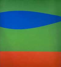
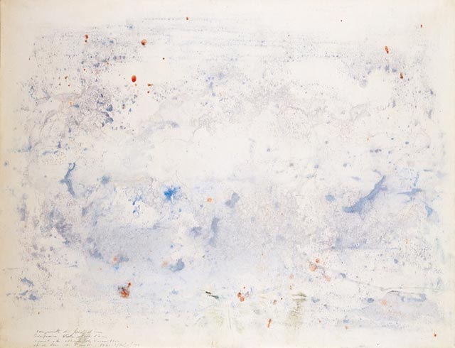
Klein’s first public exhibit in 1954 featured monochrome canvases in several shades—orange, pink, yellow as well as blue—but the audience’s placid reception enraged him, as if it were “a new kind of bright, abstract interior decoration,” as Weitermeier puts it. Klein’s response was to double down exclusively on what he considered the world’s most limitless, enveloping color: blue [International Klein Blue].

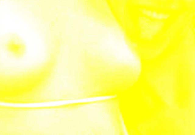
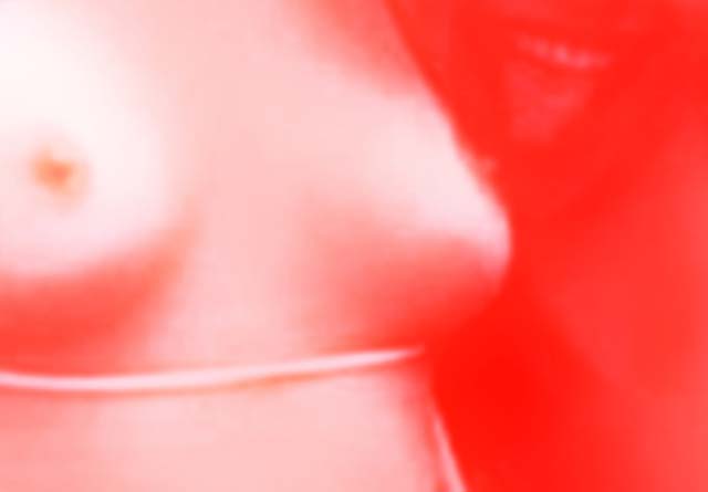
With the help of Parisian paint dealer Edouard Adam, he suspended pure ultramarine pigment—the most-prized blue of the medieval period— in a synthetic resin called Rhodopas, which didn’t dull the pigment’s luminosity like traditional linseed oil suspensions. Their much-vaunted patent didn’t apply to the color proper, but rather protected Klein’s works made with the paint, which involved rolling naked ladies in the new hue and transferring their body-images to canvas.

Invitees to two simultaneous 1957 exhibits received an blue-drenched postcard in the mail, complete with an IKB postage stamp actually canceled by the French postal service (an authentic touch Klein probably bribed his postman for).

{ Print | Continue reading }

188.jpg

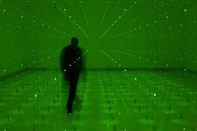
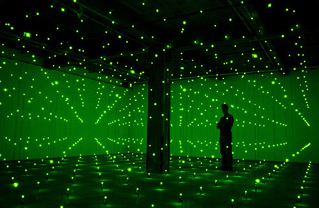
Photograph of a performance by Yves Klein at Rue Gentil-Bernard, Fontenay-aux-Roses, October 1960, by Harry Shunk

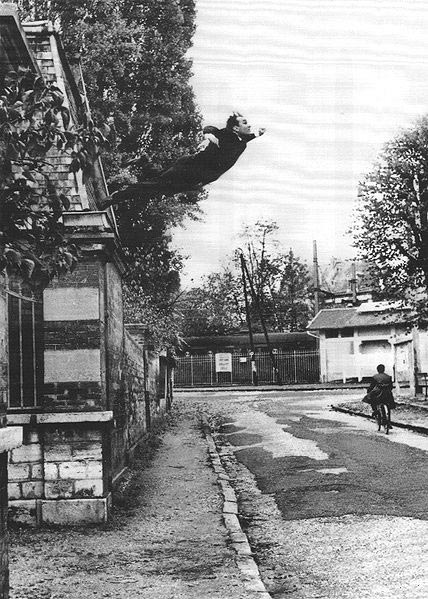
In one of the best-known photographs in art, the French artist Yves Klein projects himself confidently into space, seemingly as heavenbound as a Titian angel, while all unawares the banal figure of a cyclist goes about his earthbound business. The irony of Le saut dans le vide (Leap into the void, 1960) is that an image so faithful to Klein’s artistic quest should be a fake, a confection manufactured in the darkroom by him and the photographer who took the shot, Harry Shunk.

Klein’s performance, staged for a one-off newspaper he was planning, involved the taking of two pictures. First, Shunk photographed the street empty of all save the cyclist. Then Klein, a keen exponent of judo, climbed to the top of a wall and dived off it a dozen times — onto a pile of mats assembled by the members of his judo school across the road. The two elements were then melded to create the desired illusion.

The image, which has had a lasting influence on performance art, was expressive of Klein’s intent to explore the metaphorical void central to his work, a neutral zone free of prior prejudices. It was also a criticism of Nasa’s space travel plans, for Klein the ultimate folly of an over-materialistic world. Yet though the montage was executed under his direction, the presence of Shunk — who became a rather forgotten figure — should not be ignored.

{ The Times | Continue reading }

Four dinky sets, three garments and nighties extra, and each set slotted with different coloured ribbons, rosepink, pale blue, mauve and peagreen

1239.jpg

Just ask yourself: Which colour do you prefer ? Have you always preferred it, or did your preference change ? Can you tell why you prefer pink to, let’s say, yellow ? If you have no answer to these questions, you may wonder what’s so interesting about colour preferences. And if you have no answer, or no interest in the questions, it’s perhaps because they are not very well shaped.

Let’s first agree that color preference is an important aspect of human behavior. It influences a large number of decisions people make on a daily basis, including the clothes and make up they wear, the way they decorate their homes, the artifacts they buy or create, to name but a few examples. What is more interesting is that color is, in some sense, a superficial quality that seldom influences the practical function of artifacts. What’s more interesting for psychologists, is that we still know very little on which factors actually determine these preferences. We still don’t have a good grasp on what they are, and how to capture them descriptively: some studies have reported universal preferences (for blue rather than red); others. for highly saturated colors ; some, finally, stress cultural and individual differences.

The problem may be that testing for colour preferences has something to do with colour perception, colour labeling and cultural associations - and all these problems are hard to disconnect. Elderly people for instance tend to change their colour preferences, but this may have to do with visual impairement. (…)

Another theory suggests that women, as caregivers who need to be particularly sensitive to, say, a child flushed with fever, have developed a sensitivity to reddish changes in skin color, a skill that enhances their abilities as the “emphathizer.”

Other arguments for innate colour preferences come from animal studies - with some recent surprising discoveries.  Animal colour preferences from sexual or social contexts are assumed to have arisen owing to preferences for specific kinds of food, representing a sort of sensory bias.

{ Cognition and Culture | Continue reading }

photo { Tim Barber }

‘Her hands were of finely veined alabaster with tapering fingers and as white as lemon juice.’ –James Joyce

x.jpg

Colour does not exist. Not out in the world at any rate. All that exists in the world is a smooth continuum of light of different wavelengths. Colour is a construction of our brains. A lot is known about how the brain does this, beginning with complicated circuits in the retina itself.

Thanks to a new paper from Greg Field and colleagues we now have an even more detailed picture of how retinal circuits are wired to enable light to be categorized into different colours. This study illustrates a dramatic and fundamental principle of brain wiring – namely that cells that fire together, wire together.

{ Wiring the brain | Continue reading }

‘For every moment of triumph, for every instance of beauty, many souls must be trampled.’ –Hunter S. Thompson

516.jpg

Red is a color evoked by light consisting of the longest wavelengths of light discernible by the human eye.

Longer wavelengths than this are called infrared (below red), and cannot be seen by the naked human eye.

{ Wikipedia | Continue reading }

In Judo, for instance, fighters are allocated Blue or White prior to competition, and in Taekwon-Do, the colours are Red and Blue. Boxers often wear multi-coloured or patterned trunks, but the colour of the gloves is often different.

Hill and Barton (2005) demonstrated that in the 2004 Olympic Games Red competitors were significantly more successful than blue competitors in an even contest. Basically, Red doesn’t give you a +10 str, but it will a) tip the bias of the point recorders in your favour; b) increase one’s competitiveness; or c) scare you opponent just enough so that you have an advantage.

Their paper, published in Nature, does not speculate on the cause – a, b, and c are my own speculations. They also found that Red vs. non-red and non-blue also tipped the advantage to the red competitors. It kind of stands to reason – red is a scary colour, it’s a natural marker of many evolutionary elements, and it’s visually arresting , like black.

I thought maybe it has to do with dominance of colour – but Dijkstra and Preenen (2008) demonstrated that in Judo (where competition is between blue v white) there is no relative advantage to blue – which is arguable the more dominant colour.

{ Psycasm | Continue reading }

photo { Adam Amengual }

‘You really don’t understand something until you can explain it to your Grandmum.’ –Albert Einstein

9786.jpg

In a series of posts, I’ll review the current state of the field of the Evolution of Colour Categories.  It has been argued that universals in colour naming across cultures can be traced back to constraints from many domains including genetic, perceptual and environmental. I’ll review these arguments and show that if our perception is affected by our language, then many conflicts can be resolved.

{ Replicated Typo | Continue reading }

photo { Laurent Nivalle }

‘The mummies that exist in your heart never crumble into dust and, when you bend your head over the railing, you see them below, looking at you with their opened eyes, immobile.’ –Flaubert

1212.jpg

{ Green can contain more yellow which makes it warm but if more blue is added then green falls to the cool side. | Decorating with Warm Colors | Continue reading }

456.jpg

{ Red expresses intermediate degrees between the infernal and sublime. | Johannes Itten, The Elements of Color }

images { Imp Kerr & Associates, NYC }

Are you telling me that 200 of our men against your boy is a no-win situation for us?

2222222222.jpg

ew3.jpg

222222.jpg

ew4.jpg

…being green really is tough, so tough that the color itself fails dismally. The cruel truth is that most forms of the color green, the most powerful symbol of sustainable design, aren’t ecologically responsible, and can be damaging to the environment.

“Ironic, isn’t it?” said Michael Braungart, the German chemist who co-wrote “Cradle to Cradle,” the best-selling sustainable design book, and co-founded the U.S. design consultancy McDonough Braungart Design Chemistry. “The color green can never be green, because of the way it is made. It’s impossible to dye plastic green or to print green ink on paper without contaminating them.”

This means that green-colored plastic and paper cannot be recycled or composted safely, because they could contaminate everything else. The crux of the problem is that green is such a difficult color to manufacture that toxic substances are often used to stabilize it.

Take Pigment Green 7, the commonest shade of green used in plastics and paper. It is an organic pigment but contains chlorine, some forms of which can cause cancer and birth defects. Another popular shade, Pigment Green 36, includes potentially hazardous bromide atoms as well as chlorine; while inorganic Pigment Green 50 is a noxious cocktail of cobalt, titanium, nickel and zinc oxide.

If you look at the history of green, it has always been troublesome. Revered in Islamic culture for evoking the greenery of paradise, it has played an accident-prone role in Western art history. From the Italian Renaissance to 18th-century Romanticism, artists struggled over the centuries to mix precise shades of green paint, and to reproduce them accurately. (…)

Green even has a toxic history. Some early green paints were so corrosive that they burnt into canvas, paper and wood. Many popular 18th- and 19th-century green wallpapers and paints were made with arsenic, sometimes with fatal consequences. One of those paints, Scheele’s Green, invented in Sweden in the 1770s, is thought by some historians to have killed Napoleon Bonaparte in 1821, when lethal arsenic fumes were released from the rotting green and gold wallpaper in his damp cell on the island of Saint Helena.

{ Alice Rawsthorne/NY Times | Continue reading }

images { Erwin Redl, Matrix II, 2000 | light-emitting diode installation }


kerrrocket.svg