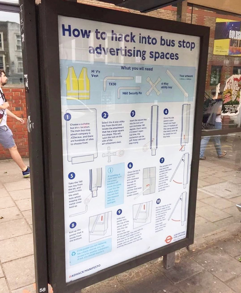
visual design
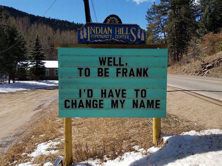
The trick is, you use the truth when you wanna tell a lie
{ Thanks Thomas! }
Like Pate-by-the-Neva or Pete-over-Meer
When privately owned land vanishes under the water, who does it belong to?
The problem is a result of the state’s rapidly changing landscape. About 80 percent of Louisiana’s coast is privately owned. But, under an old law, as coastal erosion and sea level rise turn the land into open water the area becomes property of the state, including the mineral rights underneath.
Private landowners have become more adamant about restricting access to water on their property in order to assert their claim to the minerals underneath it. But boaters often have difficulty figuring out where private property ends and public waterways begin. Since 2003, Louisiana law does not require landowners to post signs demarcating their property. The resulting confusion led the Bass Anglers Sportsman Society, or BASS, to announce in 2017 that it would no longer host professional fishing tournaments in Louisiana tidal waters, where fishers risk being arrested.
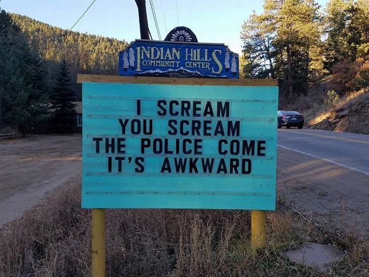
{ Scott Kelly and Ben Polkinghorne, Signs of the Times, 2017 }
This is the Hausman all paven and stoned, that cribbed the Cabin that never was owned that cocked his leg and hennad his Egg
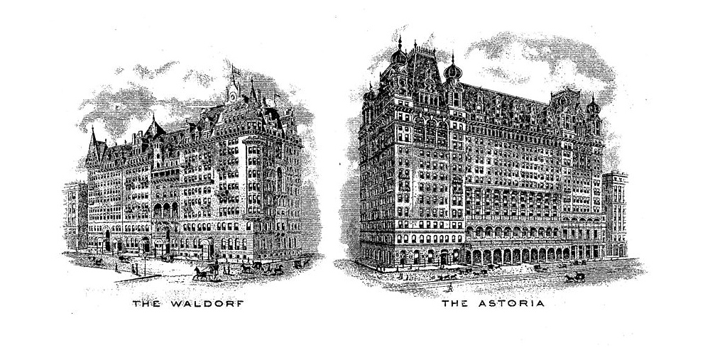
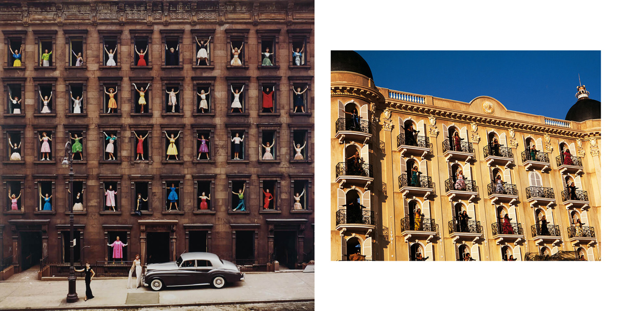
Many New Yorkers are familiar with the iconic Waldorf Astoria, which sits on Park Avenue. But they might be surprised to learn that this is the second iteration of the luxury hotel. The original was located along Manhattan’s fashionable Fifth Avenue, and the structure took up the entire block between 33rd and 34th streets. But in late November 1929 — after the stock market had crashed and the slow slide into the Great Depression began — workers began demolishing it. […] The demolition of the old hotel, completed by the winter of 1930, made way for the construction of the ultimate expression of the city’s architectural ambitions: the Empire State Building.
The original hotel started as two hotels on Fifth Avenue built by feuding relatives. The first hotel, the 13-story, 450-room Waldorf Hotel, designed by Henry Janeway Hardenbergh in the German Renaissance style, was opened on March 13, 1893, at the corner of Fifth Avenue and 33rd Street, on the site where millionaire developer William Waldorf Astor had his mansion. […]
On November 1, 1897, John Jacob Astor IV opened the 17-story Astoria Hotel on an adjacent site, and leased it to Boldt. The hotels were initially built as two separate structures, but Boldt planned the Astoria so it could be connected to the Waldorf by an alley. Peacock Alley was constructed to connect the two buildings,[21] and the hotel subsequently became known as the “Waldorf-Astoria”, the largest hotel in the world at the time.
If it smells like fish, eat it

{ Maurizio Cattelan, Comedian, 2020 — An Artist Just Ate One of Maurizio Cattelan’s $120,000 Bananas Off the Wall in Miami | Yoko Ono, Apple, 1966 — Apple was first displayed in a London gallery in 1966. It was here that Yoko Ono met John Lennon for the first time. “You know, he didn’t say anything. He just grabbed the apple and had a bite in it.” }
McCaper in retrophoebia, beck from bulk, like fantastic disossed and jenny aprils

{ Tropical Malaise }
‘Now looking at the screen, it feels like the future didn’t last long, so Find The Filter You Love The Most And Let It Kill You.’ –Fette Sans

“The human eye is extraordinarily sensitive to light,” Dr. Woods said. Throw a few dozen photons its way, a few dozen quantum-sized packets of light, and the eye can readily track them. […]
N.I.S.T. disk number two was an example of advanced ultra-black technology: elaborately engineered arrays of tiny carbon cylinders, or nanotubes, designed to capture and muzzle any light they encounter. […] The N.I.S.T. ultra-black absorbs at least 99.99 percent of the light that stumbles into its nanotube forest. But scientists at the Massachusetts Institute of Technology reported in September the creation of a carbon nanotube coating that they claim captures better than 99.995 of the incident light. “The blackest black should be a constantly improving number,” said Brian Wardle, a professor of aeronautics and astronautics and an author on the new report. “Folks will find other materials that are blacker than ours.” […]
Psychologists have gathered evidence that black is among the most metaphorically loaded of all colors, and that we absorb our often contradictory impressions about black at a young age. […] Participants were asked to link images with traits. Which boy was likeliest to cheat on the test? Which man was likely to be in charge at work? Which girl was the smartest in her class, which dog the scariest? Again and again, among both children and young adults, black pulled ahead of nearly every color but red. Black was the color of cheating, and black was the color of cleverness. A black tie was the mark of a boss, a black collar the sign of a pit bull. Black was the color of strength and of winning. Black was the color of rage. […]
Diemut Strebe, an artist in residence at M.I.T., collaborated with Dr. Wardle on a project that would merge carbon at its most absorptive configuration, in the form of carbon nanotubes, with carbon in its most reflective and refractive state, as a diamond. One of their biggest challenges: finding a jeweler willing to lend them a chunky diamond that would be plastered with what amounts to high-tech soot. “I tried many companies, Tiffany, others,” Ms. Strebe said. “I got many no’s.” Finally, L.J. West Diamonds, which specializes in colored diamonds, agreed to hand over a $2 million, 16.78-carat yellow diamond, provided the process could be reverse-engineered and the carbon nanotube coating safely removed. The resulting blackened bling is on view at the New York Stock Exchange, which Ms. Strebe calls “the holy grail of valuation.”
‘Just be true to yourself.’ –Anna Wintour
Last year the blogger Venkatesh Rao coined the term “premium mediocre.” He was referring to a segment of economic activity largely dreamed up by marketers to give the masses the illusion that they are consuming luxury […]
from Uniqlo cashmere (that doesn’t feel like cashmere at all) to Balenciaga baseball hats and Gucci headbands…
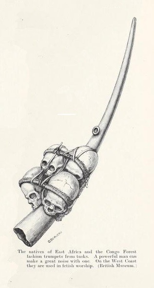
image { The natives of East Africa and the Congo Forest fashion trumpets from tusks. Man and Beast in Eastern Ethiopia. J. Bland-Sutton. London, Macmillan & Co., 1911. }
a jungle of love and debts and jangled through a jumble of life in doubts

{ Overnight, Gem Spa was transformed into SchitiBank | more | ThanksTim }
History, Stephen said, is a nightmare from which I am trying to awake

Multidisciplinary studio curiosity has completed the flagship store of streetwear brand hipanda in omotesando, tokyo, combining digital and analogue features. The immersive retail interior brings together architectural elements with AR (augmented reality) and AE (augmented experience) technology in a sequence of spaces, inviting the visitor to look for the ‘host’ of the house, who is revealed through different interactive experiences, some digital and other analogue.
Curiosity has decked the hipanda store façade with the brand’s logo, which ‘jumps’ towards passersby with visual effects displayed through animations. inside, the main room features a play of light in constant motion, while the gallery space introduces products in a constant movement through AR, continually changing the presentation of the displays to bringing attention to the collection. The room’s walls are half-clad in mirrors, blurring the perception between digital and virtual.
photo { Butcher shop specialized in game meat and poultry exhibiting a camel, Paris, 1908 }
langsome heels and langsome toesis
The Evian bottle you tossed in the recycling bin may appear on a shelf at the grocery store a year from now. […]
for much of the last century, clothes were considered durable goods, rather than disposable goods, so the problem of recycling clothes seemed less pressing than recycling, say, plastic bottles. But fast fashion made clothes so cheap that many consumers now think of clothes as disposable. […] A new era of fashion recycling is finally arriving. A startup called For Days, for instance, has created a T-shirt subscription service that allows customers to return a shirt after they are done wearing it, and the company will recycle that material into new T-shirts.
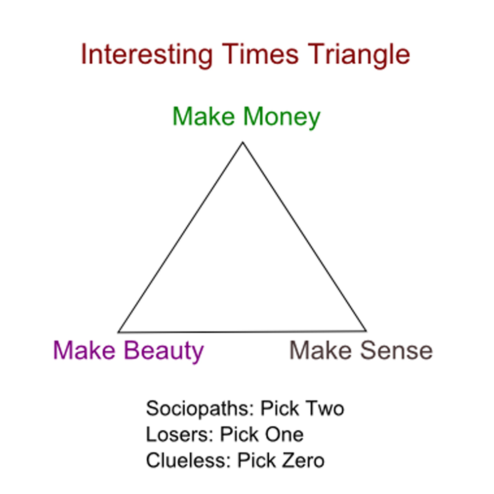
Can we live without certainty?
The next one on my list was Doris Devermont, an old flame of mine. With her I’d had the most honest relationship I’d ever had with a woman. The only thing I’d lied about was my name. I’d told her I was Teddy Novak… So she couldn’t track me down if I got her pregnant.
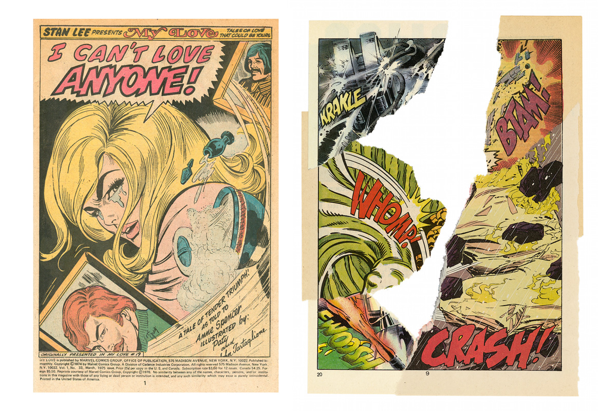
art { “I Can’t Love Anyone!” from My Love #33, March 1975, originally published in My Love #19, September 1972 | Christian Marclay, Whomp, 2006 }
“The White House called me to advise to help change the system of clemency,” Kim Kardashian-West said. “And I’m sitting in the Roosevelt Room with, like, a judge who had sentenced criminals and a lot of really powerful people and I just sat there, like, Oh, shit. I need to know more.”
A man who had just bought an $8 million island off of Key West was arrested Saturday for participating in what police described as a scheme to steal $300 in household items from Kmart.
Officials at Kmart called Key West police April 5 after they say Andrew Francis Lippi, 59, had purchased several items, including a Keurig coffee maker and light bulbs, and returned the original boxes for a refund. But police say the boxes were stuffed with other items. For example, store officials said a basketball was inside the Keurig box. […]
The Miami Herald reports Lippi bought Thompson Island, which had been the home to the family of philanthropist Edward B. Knight. Lippi also owns the “Real World” house in Key West, where MTV shot its 17th season in 2006. […]
Lippi told the Herald the theft allegation is “complicated” and he’d rather not talk about it.
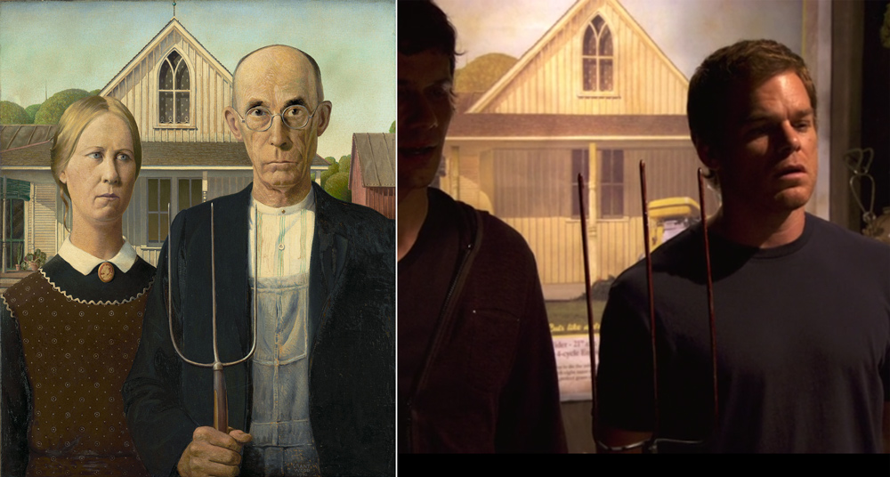
images { Grant Wood, American Gothic, 1930 | Dexter, Episode 7, Season 6 }
‘If there is anyone who owes everything to Bach, it is certainly God.’ –Cioran
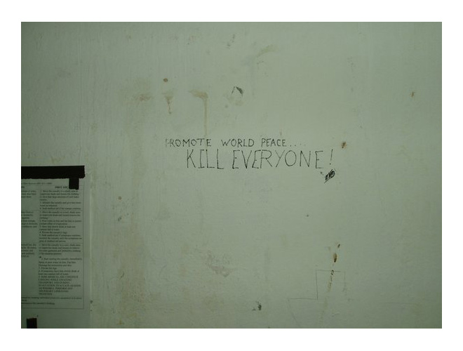
“I took this photo of an interior wall of a gate guard tower at ‘Victory Base’ in Baghdad in 2004. The graffiti is a classic example of the grim and cynical sense of humor soldiers cultivate in order to maintain their sanity in war.” —Stephen Richey, U.S. Army, 1977-2010
who’s that peeping in my window, wow, the Feds on me now
Paranoia is the most common symptom of psychosis, but paranoid concerns occur throughout the general population. […]
We suggest that paranoia should not solely be viewed as a pathological symptom of a mental disorder but also as a part of a normally-functioning human psychology.
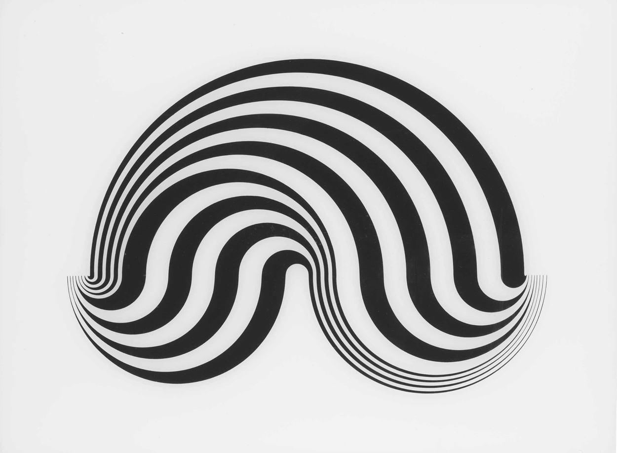
screenprint on Perspex { Bridget Riley, Untitled [Fragment 5/8], 1965 }
This is very surprising and it is a really bad news for CoCos, specially for those that have low coupon for the first call
Revising things makes people think they are better, absent objective improvement. We refer to this phenomenon as the revision bias. […]
We propose that the fact that revisions typically are intended to be improvements over their originals gives rise to an overgeneralized heuristic that revisions necessarily are improvements over their originals. Yet, as any author responding to editorial reviews knows, not every revision turns out better than before. […]
Things that are objectively unchanged (or even made worse) in the revision process may nonetheless be adopted, so long as observers believe they possess a “revised” version.
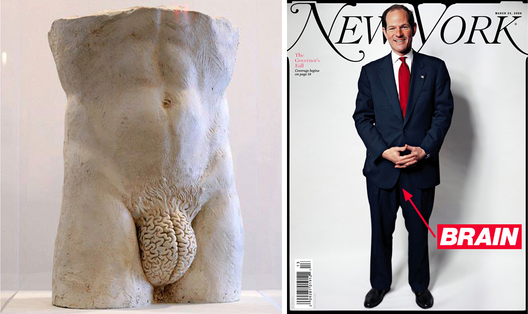
images { Sculpture by Yoan Capote | Barbara Kruger-annotated photo of Eliot Spitzer for New York magazine, 2008 }
all our wild dances in all their wild din
Previous research shows conflicting findings for the effect of font readability on comprehension and memory for language. It has been found that - perhaps counterintuitively – a hard to read font can be beneficial for language comprehension, especially for more difficult language.
Here we test how font readability influences the subjective experience of poetry reading. […] We found that participants rated easy poems as less nice when they were presented in a hard to read font, as compared to when presented in an easy to read font. […] we did not observe the predicted opposite effect for more difficult poems.
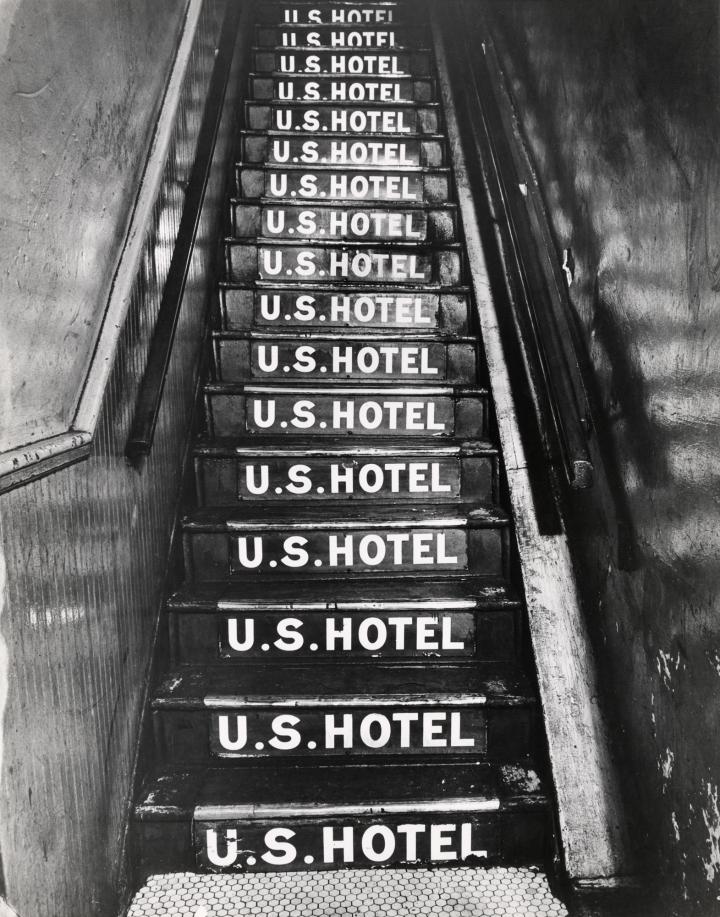
photo { Weegee, Untitled [U.S. Hotel at 263 Bowery], 1943‐45 }