visual design
‘Everything you can imagine is real.’ –Picasso
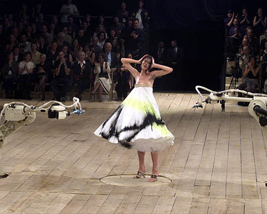
{ Spring/Summer 1999, Mcqueen ended his show w/ model Shalom Harlow standin’ in a white dress on a rotatin’ platform, bein’ spray painted by robotic arms. }
‘Tell the truth and run.’ –George Seldes
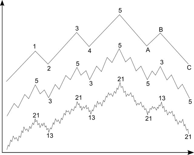
{ Elliott waves. Bull Market: Left to centre. Bear Market: Right to centre. | The Elliott Wave Principle is a detailed description of how financial markets behave. The description reveals that mass psychology swings from pessimism to optimism and back in a natural sequence, creating specific wave patterns in price movements. Each pattern has implications regarding the position of the market within its overall progression, past, present and future. | Wikipedia | Continue reading }
Won’t last. Always passing, the stream of life, which in the stream of life we trace is dearer than them all.

{ John Clang }
The gently champing teeth
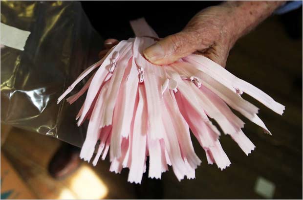
{ How many zippers does he have? “One million, millions, I don’t know — more than a million,” said Mr. Feibusch, 86, a zipper man going on 70 years. Anyway, he can find you a zipper. “Tell me what size and what length and I’ll give it to you within 30 seconds,” he vowed. | NY Times | Full story }
‘Marriage is a great institution, but I’m not ready for an institution.’ –Mae West
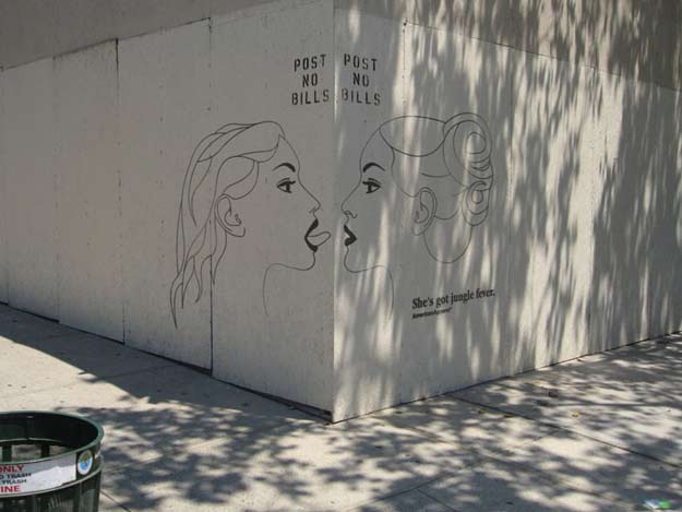
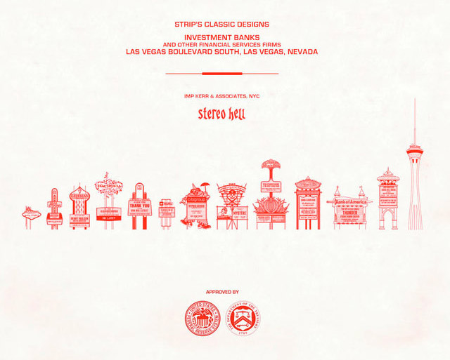
{ stereohell, 2008 }
Half a mo. Maximum the second.

Ruby Mazur, creator of the Rolling Stones’ lips-and-tongue logo, received a call most artists only dream about.
A native New Yorker and a Las Vegas resident since 2000, Mazur has been invited by the prestigious Whitney Museum of American Art in New York to show a retrospective exhibition of his entire collection of paintings.
“That’s heavy, man,” Mazur said Thursday. The Whitney is considered among the worlds’ top contemporary museums.
Las Vegans might get first peek at the exhibition. Mazur not only has a one-man exhibition at Art de Vignettes at the Fashion Show Mall on July 22, but the Whitney might launch the exhibition here, Mazur said.
His Stones’ logo was selected in 1971 after Mick Jagger asked Mazur to create it. It made an immediate splash.
“I did it over a weekend and when I took it to his house on Mullholland Drive (in Hollywood), I gave it to him outside by his pool. He got so excited he pushed me, and I fell back into the pool, fully dressed.”
The logo remains the Stones’ emblem.
“It made me,” Mazur said.
He’s done more than 3,000 album covers, including childhood pal Billy Joel ’s “Cold Spring Harbor,” Elton John ’s “Friends,” and the soundtrack album cover and artwork for the advertising campaign for “Willy Wonka and the Chocolate Factory.”
{ Las Vegas Review Journal, 2000 | Rubymazurgallery.com }
photo { Tim Barber }
‘Nuclear power and electric cars mean $0.99 gasoline.’ –David Crane
Officials from the U.S. Department of the Treasury, the Board of Governors of the Federal Reserve System and the United States Secret Service today unveiled the new design for the $100 note. Complete with advanced technology to combat counterfeiting, the new design for the $100 note retains the traditional look of U.S. currency. (..)
There are a number of security features in the redesigned $100 note, including two new features, the 3-D Security Ribbon and the Bell in the Inkwell. These security features are easy for consumers and merchants to use to authenticate their currency.
The blue 3-D Security Ribbon on the front of the new $100 note contains images of bells and 100s that move and change from one to the other as you tilt the note. The Bell in the Inkwell on the front of the note is another new security feature. The bell changes color from copper to green when the note is tilted, an effect that makes it seem to appear and disappear within the copper inkwell.
I can make it anywhere, yea, they love me everywhere
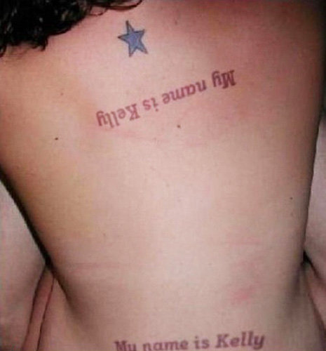
{ Thanks Glenn }
A heavy tramcar honking its gong slewed between. Lost it.
|
{ Death In Vegas, Dirt | Directed by Andrea Giacobbe | via Colleen Nika } |
{ Aphex Twin - Come to daddy | Directed by Chris Cunningham } |
Although humans usually prefer mates that resemble themselves, mating preferences can vary with context. Stress has been shown to alter mating preferences in animals, but the effects of stress on human mating preferences are unknown. Here, we investigated whether stress alters men’s preference for self-resembling mates. (…) Our findings show that stress affects human mating preferences: unstressed individuals showed the expected preference for similar mates, but stressed individuals seem to prefer dissimilar mates.
Both in the grey and in reality
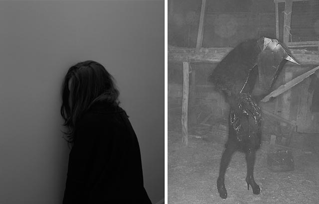
{ 1. Grant Willing | 2. David Sherry }
‘Everyone who wants to do good to the human race always ends in universal bullying.’ –Aldous Huxley
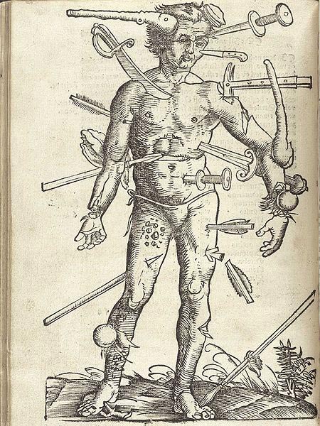
{ Wound Man is an illustration which first appeared in European surgical texts in the Middle Ages. It laid out schematically the various wounds a person might suffer in battle or in accidents, often with surrounding or accompanying text stating treatments for the various different injuries. | Wikipedia | Continue reading }
It’s incredibly obvious, isn’t it? A foreign substance is introduced into our precious bodily fluids without the knowledge of the individual.
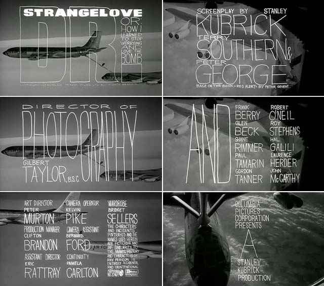
Stanley Kubrick’s Dr. Strangelove or: How I Learned to Stop Worrying and Love the Bomb (1964)’s frightening absurdity was established in the very first frame of the main title sequence designed by Pablo Ferro. (…)
Surprinted on these frames the film’s title and credits are full-screen graffiti-like scrawls comprised of thick and thin hand-drawn letters, unlike any movie title that had preceded it. (…)
It launched the long career of Pablo Ferro as title designer, trailer director, and feature filmmaker. Yet before he started designing film titles the Cuban born Ferro (b 1935), who had emigrated to New York City when he was twelve years old - and quickly became a huge film fan and aficionado of UPA cartoons - had earned a reputation for directing and editing scores of television commercials. After graduating from Manhattan’s High School of Industrial Art, Ferro began working at Atlas Comics in 1951 as an inker and artist in the EC-horror tradition. (…)
As a consummate experimenter, Ferro introduced the kinetic quick-cut method of editing whereby static images (including engravings, photographs, and pen and ink drawings) were infused with speed, motion, and sound. In the late 1950s most live-action commercials were shot with one or two stationary cameras, conversely Ferro took full advantage of stop-motion technology, as well shooting his own jerky footage with a handheld Bolex. Unlike most TV commercial directors, Ferro maintained a strong appreciation and understanding for typography such that in the late 1950s he pioneered the use of moving type on the TV screen. (…)
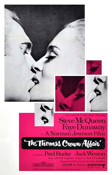
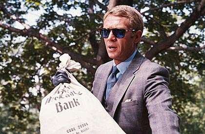
Ferro’s title for The Thomas Crown Affair, directed by Norman Jewison in 1968, introduced multi-screen effects for the first time in any feature motion picture and defined a cinematic style of the late 1960s. (…)
The Thomas Crown Affair won an Academy Award and served as a model for other films of that era (remember Woodstock?). It also convinced Steve McQueen, who starred in and produced the film, to hire Ferro to do titles for his next movie, Bullitt, which launched an uninterrupted thirty-year string of title and trailer commissions. (…)
One of his most engaging recent title sequences, edited with his son Allen Ferro, for the 1995 murder farce To Die For, directed by Gus Van Sant, gave him an opportunity to test how far he could develop the film’s leading character in the few minutes prior to the start of the action.
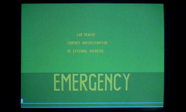
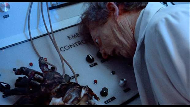
screenshots { Dr. Strangelove }
bonus:
