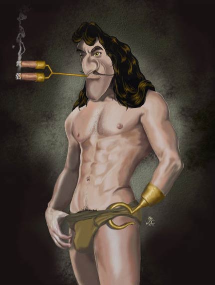
visual design
Come around with the plate perhaps. Pay your Easter duty.

{ The Sun’s motion about the centre of mass of the Solar System is complicated by perturbations from the planets. Every few hundred years this motion switches between prograde and retrograde. | Wikipedia | Continue reading }
I can get Lady Fingers to come
Lancey Howard: Gets down to what it’s all about, doesn’t it? Making the wrong move at the right time.
Cincinnati Kid: Is that what it’s all about?
Lancey Howard: Like life, I guess.
Wake this time next year
{ 1. Unsourced image | 2. Maurizio Cattelan, Untitled, 2000 }
‘You really don’t understand something until you can explain it to your Grandmum.’ –Albert Einstein
In a series of posts, I’ll review the current state of the field of the Evolution of Colour Categories. It has been argued that universals in colour naming across cultures can be traced back to constraints from many domains including genetic, perceptual and environmental. I’ll review these arguments and show that if our perception is affected by our language, then many conflicts can be resolved.
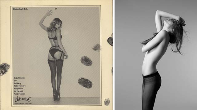
photo { Laurent Nivalle }
‘The mummies that exist in your heart never crumble into dust and, when you bend your head over the railing, you see them below, looking at you with their opened eyes, immobile.’ –Flaubert
{ Green can contain more yellow which makes it warm but if more blue is added then green falls to the cool side. | Decorating with Warm Colors | Continue reading }
{ Red expresses intermediate degrees between the infernal and sublime. | Johannes Itten, The Elements of Color }
images { Imp Kerr & Associates, NYC }
First communicants. Hokypoky penny a lump.

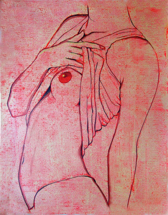
Body Image Distortion
In their study, Longo and his colleagues asked volunteers to place their left hand palm-side-down underneath a board and to then estimate the size of their hand. (…) As it turns out, volunteers consistently overestimated the width of their hand—sometimes by up to 80%.
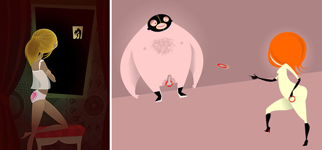
artwork { Geneviève Gauckler }
‘After your death you will be what you were before your birth.’ –Schopenhauer
A few years ago I decided that I’d be happy as long as I spent most of my time doing my three favorite things: reading, writing, and fucking (the three R’s).
image { e-Baby | watch the video | More: Pleix.net }
I hate being odd in a small town if they stare let them stare in New York City
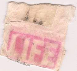
{ The Social Art Collective is proud to present Heroin Stamp Project, an exhibition focusing on the branding of heroin in New York City. At once beautiful and unsettling, the images in the exhibit illustrate a complex narrative around public health and preventable consequences of injection drug use. | White Box, 329 Broome Street, NYC | June 23rd - June 29th, 2010 | Thanks Ser Gee! }
You and me, don’t you know? In the same boat. Softsoaping.
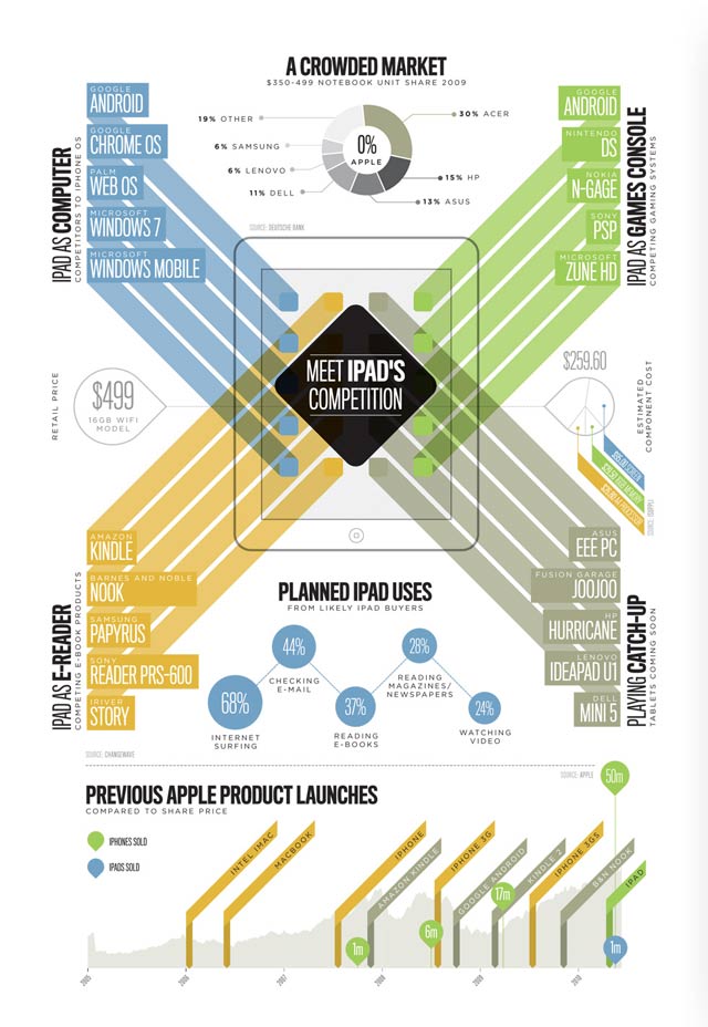
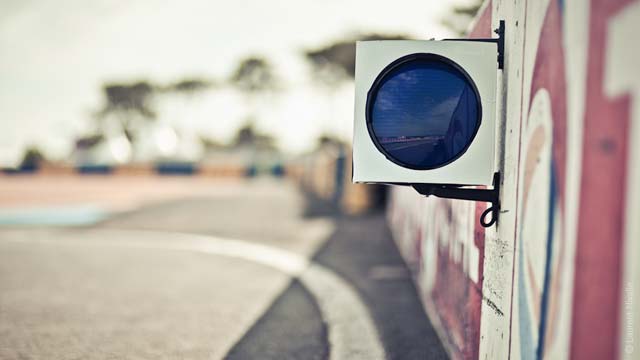
{ Apple’s iPad Competition | Related: Apple, AT&T Cite Record iPhone Sales }
Could meet one Sunday after the rosary

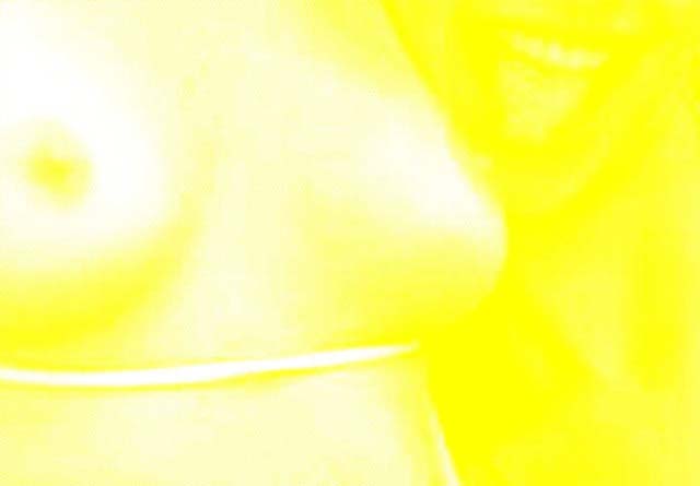
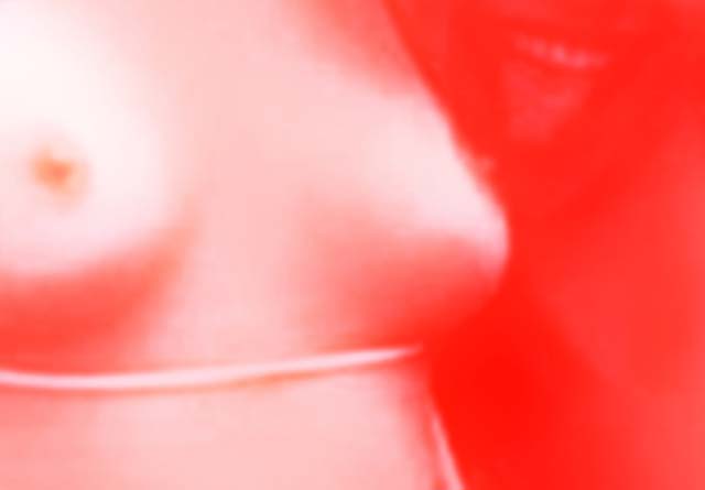
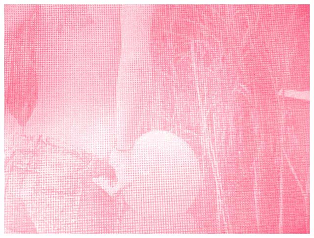
{ Eizo: Pin-up Calendar 2010 | EIZO medical imaging high precision displays for the examination and diagnosis of radiographs. Whereas craftsmen are showered with pin-up-calendars at the end of every year, this kind of present is less popular among medics. EIZO breaks this taboo. This pin-up calendar shows absolutely every detail. | Advertising Agency: Butter, Berlin/Duesseldorf, Germany. | Thanks JJ }
‘The great enemy of the truth is very often not the lie–deliberate, contrived and dishonest–but the myth–persistent, persuasive and unrealistic.’ –John Fitzgerald Kennedy
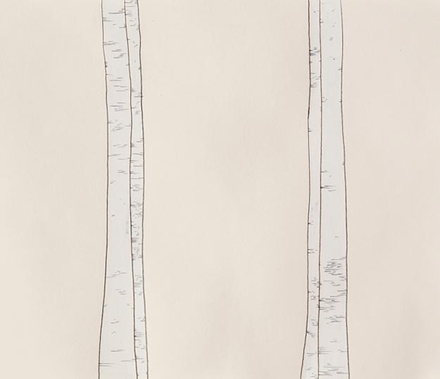
Tracing paper is a type of translucent paper. It is made by immersing uncut and unloaded paper of good quality in sulphuric acid for a few seconds. The acid converts some of the cellulose into amyloid form having a gelatinous and impermeable character. When the treated paper is thoroughly washed and dried, the resultant product is much stronger than the original paper. Tracing paper is resistant to oil grease and to a large extent impervious to water and gas.
Tracing paper is named as such for its ability for an artist to trace an image onto it. When tracing paper is placed onto a picture, the picture is easily viewable through the tracing paper. Thus, it becomes easy for the artist to find edges in the picture and trace the image onto the tracing paper.